
Gina Cucina
Soups that "Warm Your Soul"Culinary Passion
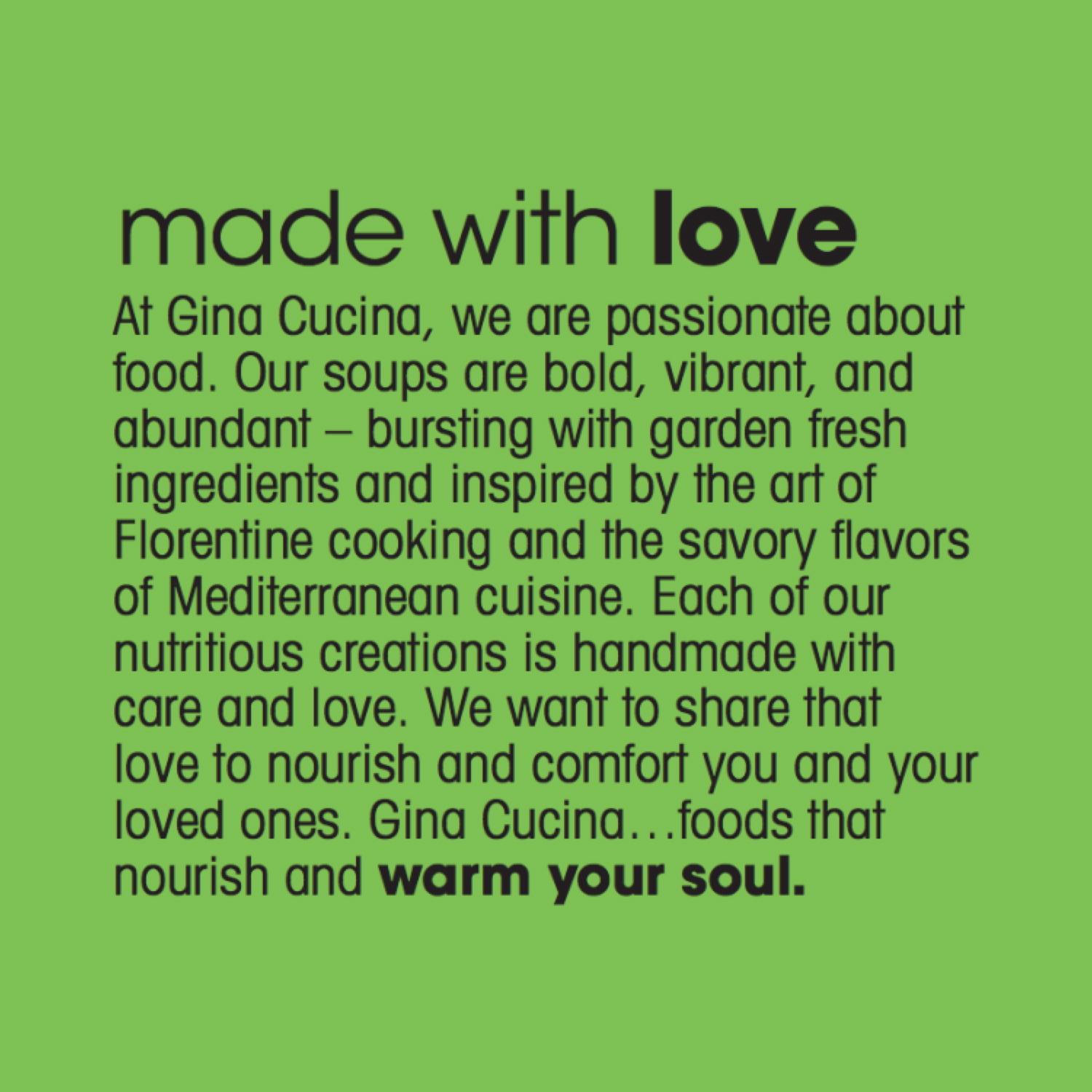
Nourishment and Love
Brand Positioning and Story
Clear Label
Packaging that Communicates Benefit
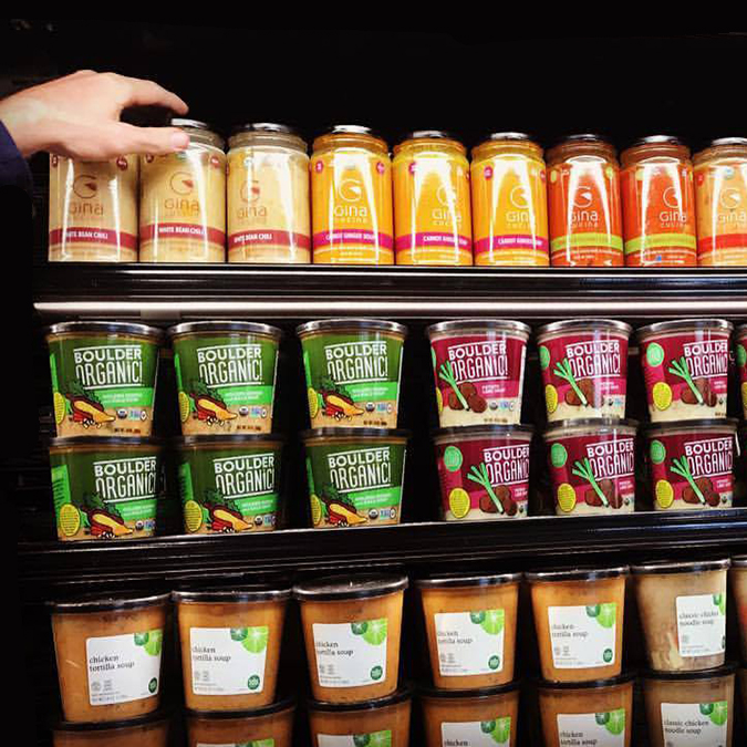
Shelf Impact
About This Project
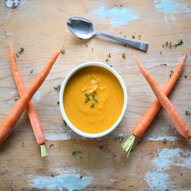
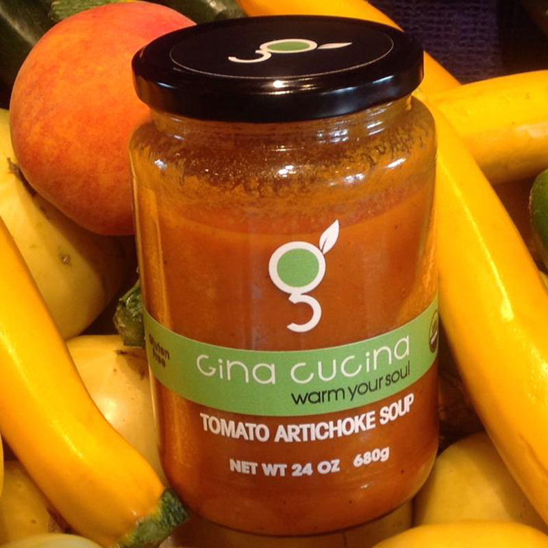
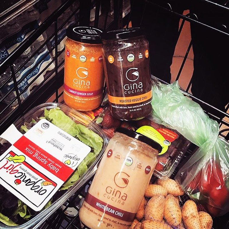
Gina’s soups are vibrant, colorful, and full of (highly visible) healthy ingredients. They make a statement all on their own. But we wanted to show them off even more as we planned the brand’s label and packaging. For the brand’s logo, we elected for something subtle, a stylized “g”, with a leaf for ligature and “cup handle”. It’s a simple icon that’s open and friendly…just like Gina herself. To round out the primary display panel label, we decided on an all-green color design system for all soups. And why not? After all, these soups are colorful enough to provide enough contrast for retail shelf impact.
John Recca and the crew at Brandwerks Group were wonderful to work with and did an amazing job with our packaging... WE LOVE IT!! Thanks!! – Gina Stryker, Owner, Gina Cucina
John Recca and the crew at Brandwerks Group were wonderful to work with and did an amazing job with our packaging… WE LOVE IT!! Thanks!!
For the jar, we elected something tall and uncomplicated, the perfect canvas for all this delicious color. And last, a contrasting black lid with the “g” icon, the perfect exclamation point to cap off these warming soups. Read more about Gina Cucina, in our Blog post, “The Brand Personified” and get to understand the passion behind this brand.