
14 Sep A Honey of a Rebranding
Meadery of the Rockies is a leading U.S. producer of meads, or honey wines. But, in terms of volume, meads represents only a small segment, less than 1% of total wine consumption. Mead distribution is somewhat limited and products are not generally top-of-mind with consumers.
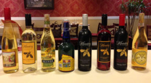
Packaging (before). Not inspiring.
Compared to traditional/table wines, meads are typically much sweeter in style, which means that they should have consumer appeal, particularly to novice or infrequent wine drinkers who prefer sweeter-edged products. But they don’t…mainly we believe because the concept of “mead” is somewhat confusing to most consumers. Further, the products are perceived as being historical and obscure (particularly given Medieval and “new age” names), not relevant to many consumption occasions, and having inconsistent quality among brands.
For Meadery of the Rockies to grow and reach out to mainstream consumers it was obvious to us that the brand needed a friendlier, more relevant image. It needed a complete rebranding, and with packaging that would stand out on the shelf.
...it was obvious to us that the brand needed a friendlier, more relevant image
Competitive Brand Sort. Ranked by attribute.
Working with our client, we researched the category and conducted two daylong BrandVision™ sessions. One exercise that we conduct is a “competitive brand sort”. Here we reviewed several competing brands to evaluate their positioning and label/packaging communication to see how these brands might be perceived by consumers, and how certain imagery cues (like bottle shape, naming, colors, etc.) influence perception. What we learned provided excellent strategic direction for branding refinements.
New brand identity…colorful & friendly
Strategically, we decided to focus on honey for a number of reasons. Besides being easier to understand, honey has many positive attributes. It is also gaining popularity within many alcohol beverage categories and segments (e.g., beer, spirits, ciders, etc.). So number one, we changed the brand’s statement of identity to simply, “Honey Wine”.
Strategically, we decided to focus on honey for a number of reasons
Then the brand’s identity/logo. From our positioning work, we wanted to communicate, metaphorically, the brand’s benefit of “energy”. Importantly, we wanted to improve the word mark typography to make it more elegant, contemporary, and readable. Next, the icon itself. The current bee was too bold, lifeless, and unfriendly…definitely not very inviting if we wanted to bring new consumers to the brand.
A “Honey” of a New Look
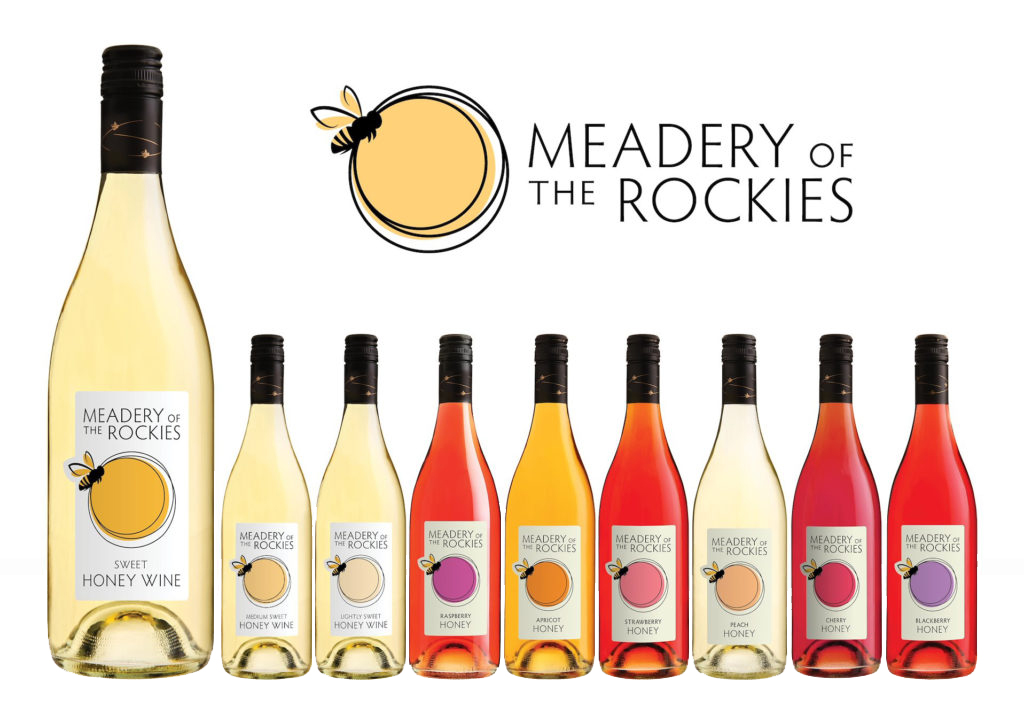
Instead, we decided to add a bit of abstract whimsy with a friendlier bee and a vibrant color circle (sun, top view of a wine glass, etc.) surrounded by “energetic” bee flight lines. We now had our design system for color coding all flavor types within the extensive product line.
In order to create greater appeal among wine drinkers (particularly white wine consumers) we decided on a new bottle shape: a more elegant, softer “Burgundy” style bottle, rather than the current stiff shouldered “Bordeaux/Claret” shape.
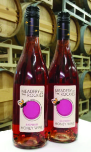
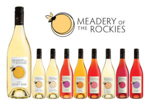
Packaging (New). Bright, colorful, elegant, and inviting.
Importantly, we wanted the bottle to be clear, so that consumers could actually see the product, eliminating the potential “fear factor” of honey wines, but more importantly, so they could see the beauty of this colorful product.
Last, to “top things off” and give the brand a premium look, we designed a new closure capsule for the bottle top. The matte black finish features our friendly bees in golden artistic and energetic motion. Overall, Meadery of the Rockies is essentially a new brand – buzzing with excitement and the opportunity to generate sales!