
13 Sep A Saintly Brand Refresh
St. Kathryn Cellars is a different kind of wine. That’s because it’s made not from wine grapes, but from fruit and botanicals. Its sweetness makes it easy to drink, and that gives it appeal to entry level and novice wine drinkers and perfect for casual drinking occasions.
Old package. Dull, dated and not very refreshing.
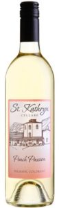
This is not a serious wine, but instead something that’s refreshing and joyful to drink. Over the years, the brand cultivated a good following on the strength of some of its popular flavors like “Peach Passion” and “Lavender”, but recently began to lose its luster and new trial/repeat purchase potential among the sea of competitive offerings. To reverse course this brand needed to be completely “refreshed” to better communicate the outstanding taste and flavor that’s already in the bottle.
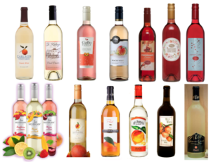
The competition. Plenty of visual refreshment.
For us, strategy drives our approach and work. To start, we conducted a day-long focus group/ideation session with winery team members and consumers. This was a high-paced, hands on session loaded with fun, engaging exercises. Perhaps the most illuminating exercise of the day was the “Competitive Brand Sort”, where we evaluated competitive brands and our client’s current communication. Here we learned that St. Kathryn Cellars was the only fruit wine brand without any fruit on the label. That was pretty obvious! But most importantly, and because of the lack of perceived refreshment and the brand’s very dated look, the group participants valued the brand at only $10/bottle, significantly less than the actual shelf price of $15-$17 per bottle. And that was a big problem.
St. Kathryn Cellars was the only fruit wine brand without any fruit on the label.
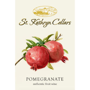
Front Label. Orchard Fresh Fine Art.
Our solution was not simply to add fruit to the label. The brand needed much more than that: it needed a unique and sustainable positioning, i.e., a brand promise that would exude refreshment and premium-ness. The fruit that’s fermented into this wine is authentic. It’s real, and mostly fresh picked from nearby orchards. It’s orchard fresh. That’s an important distinction versus some fruit wine competitors who blend fruit juice and flavors into a neutral grape wine base. With the brand’s positioning now created, we focused on design direction.
Elevating the brand’s perceived value was a top priority, so we decided upon original and proprietary fine art (as opposed to the more “commercial” look and feel of photography). But this art should not be perfect or precise, but instead, natural to evoke the just picked flavor of the land.
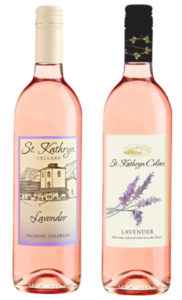
Before and after. Now orchard fresh and ready for market.
The fruit that’s fermented into this wine is authentic. It’s real, and mostly fresh picked from nearby orchards. It’s orchard fresh.
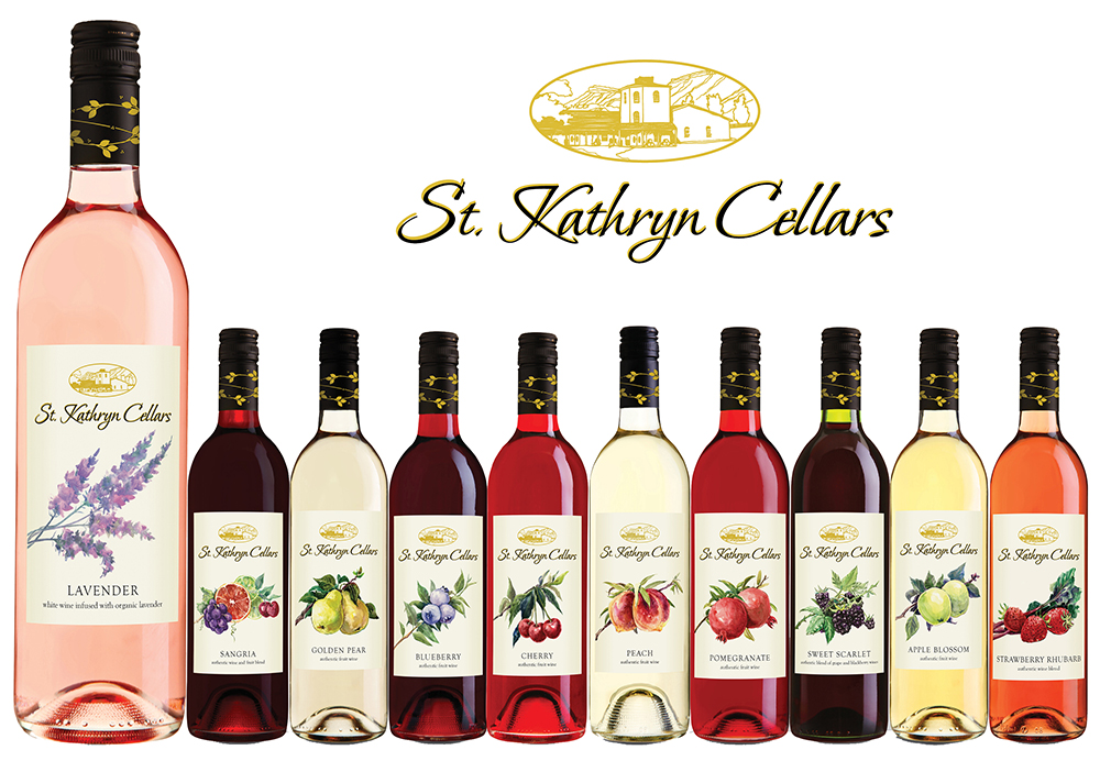
With creative direction in hand, our designer, Lisa Padgett discovered Suren Nersisyan, a watercolor artist represented on Etsy and engaged him to create a collection of watercolors for all of the brand’s 11 wines. His work proved to be stunning – artistically communicating the authenticity of orchard fresh fruit – stem and all!
Then on to the label design system, starting with the brand’s identity which we wanted to simplify in order to emphasize the “real hero” of the label, the fruit itself. Here we reduced the size of the (irrelevant) winery building and unstacked the word mark, placing it on one line while adding an elegant gold outline to its familiar script font. To complete the front label design, we added the product name/statement of identity, and descriptor to reinforce the brand’s authentic, orchard fresh positioning.
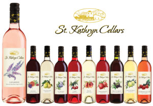
The Full Product Line
To “top things off”, just like we did with our client’s Meadery of the Rockies brand, we designed a new closure for the bottle top. The contrasting matte black finish features an intriguing golden vine pattern to reinforce the brand’s farm and orchard fresh origins. The timeless richness of black and gold adds to the clean, artistic look of the label, giving the brand a perceived value now upwards of $20/bottle.
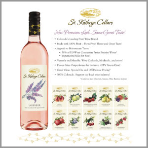
Sales Flyer with Features and Benefits.
With packaging complete, it was time for relaunch. Brandwerks is a complete, one-stop brand development company. Each and every brand we work on must meet not just a consumer need, but a customer need as well. In other words, the brand must give the trade a reason to purchase and promote. The St. Kathryn Cellars brand has many product features. For the brand to sell and be successful, those features needed to be converted to benefits.
Each and every brand we work on must meet not just a consumer need, but a customer need as well.
The wine industry is incredibly competitive and retailers and restaurateurs are not looking for another brand – especially a brand in a niche category like fruit wines. To aid selling efforts, we created a one-page sales flyer presentation demonstrating the brand’s uniqueness and purchasing potential, particularly with infrequent and entry level consumers.
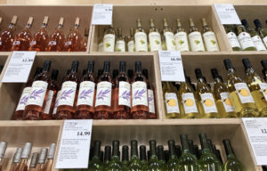
Now in market and growing significantly!
According to a research study conducted by Sonoma State University’s Wine Business Institute, 58% of American consumers prefer sweeter edged and fruitier style wines. That’s a big purchasing group to reach and connect with, and now with the brand’s new and refreshing look, that selling job just became much easier!