
20 Sep The Brand Personified
 At Brandwerks, we talk a lot about the need to “be the brand”, and why it’s important for your brand to reflect your vision and your inspiration. At Brandwerks, we work with many entrepreneurs who have very unique products. There’s passion and creativity in most everything they do. These people are artists with unique recipes and unusual ingredients, imparting their personality in every batch that’s crafted. They are mission-driven people with a purpose.
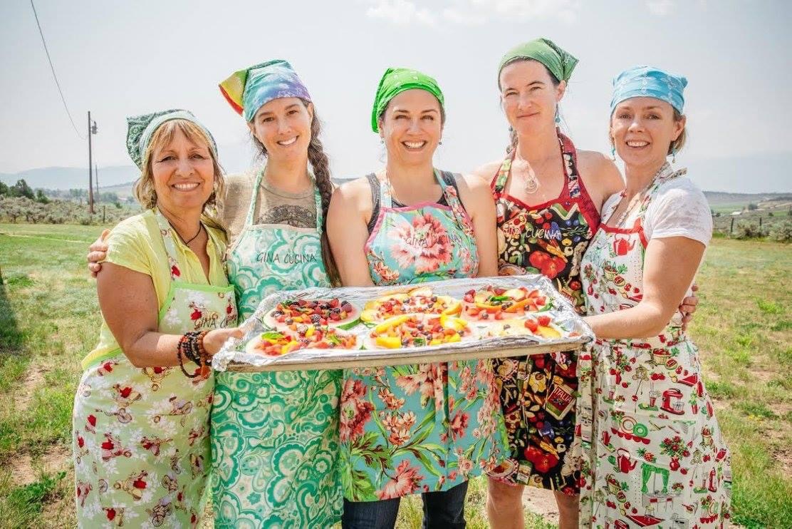
Just like Gina Stryker, owner of Gina Cucina. Gina studied cooking for two years at the Dante Alighieri School in Florence, Italy. She was greatly influenced by her grandfather, a native of Italy and a chef. Her motivation for starting her business was simply, but expansively to share her love of food and to provide comfort and nourishment others. Gina’s vision is about love.
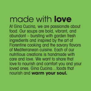
 A brand is more than product. It’s a promise to deliver and provide some unique benefit. As we worked with Gina, getting to know her and the depth of her inspiration, we wanted to understand the benefit of this “love”. Through our proprietary benefit laddering technique that we call BrandLaddering, we soon discovered from Gina and her team that love translates to nourishment, comfort and warmth. It’s more than physiological: it’s emotional, and it runs deep, all the way to the soul. The benefit, which became the brand’s tagline: “warm your soul”.
The benefit, which became the brand’s tagline: “warm your soul”
 Gina’s soups are vibrant, colorful, and full of (highly visible) healthy ingredients. They make a statement all on their own. And we wanted to show them off as we planned the brand’s label and packaging. For the brand’s logo, we elected for something subtle, a stylized “g”, with a leaf for ligature and “cup handle”. It’s a simple icon that’s open and friendly…just like Gina herself.
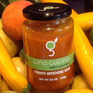 To round out the primary display panel label, we decided on an all-green color design system for all soups. And why not? After all, these soups are colorful enough to provide enough contrast for retail shelf impact. For the jar, we elected something tall and uncomplicated, the perfect canvas for all this delicious color. And last, a contrasting black lid with the “g” icon, the perfect exclamation point to cap off these warming soups.
To “be the brand” and be successful, you need to put your heart and soul into everything you do. For Gina, spreading the love of her soups is second nature. It’s her passion. It’s her heart and soul. It’s also her name. And it’s on the label.