
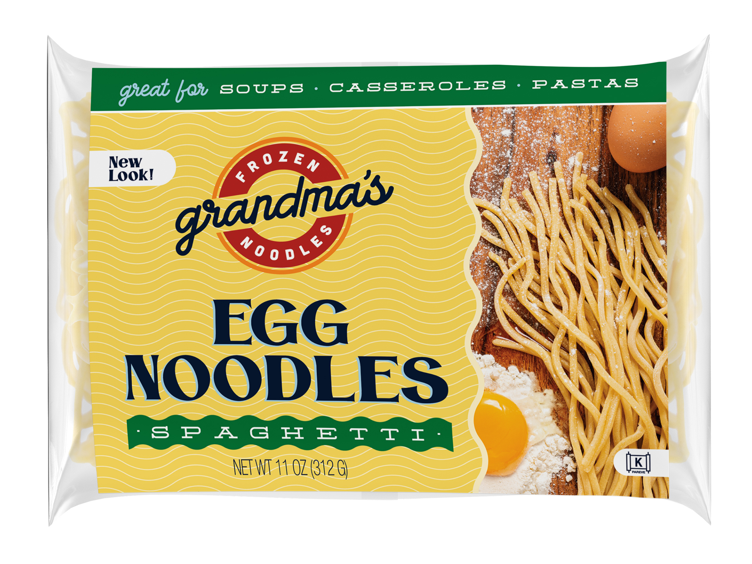
Grandma’s Frozen Noodles
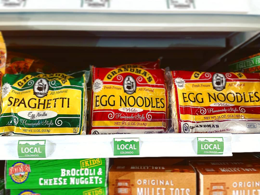
Rebranding and New PackagingPackaging before. Dated and low price/quality perception
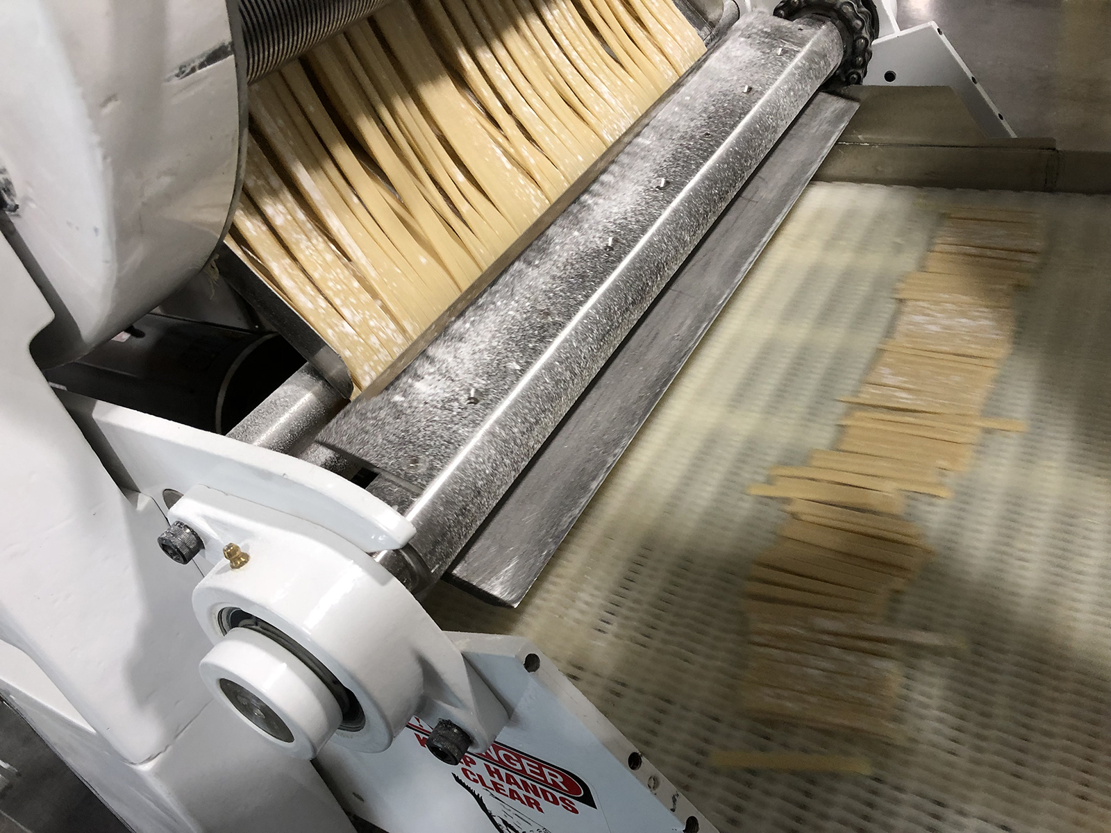
High Quality, Bronze-Drawn Pasta
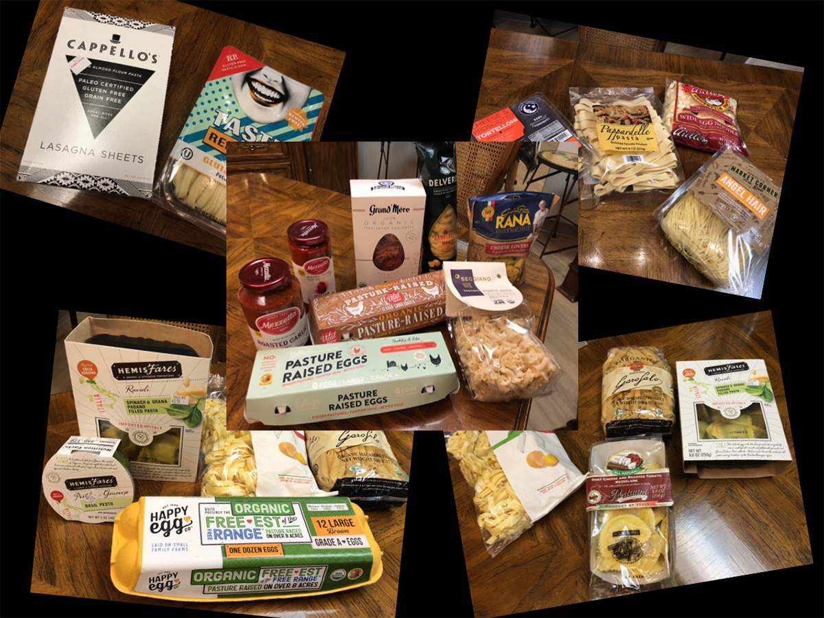
Competitive Packaging Sort
New Packaging
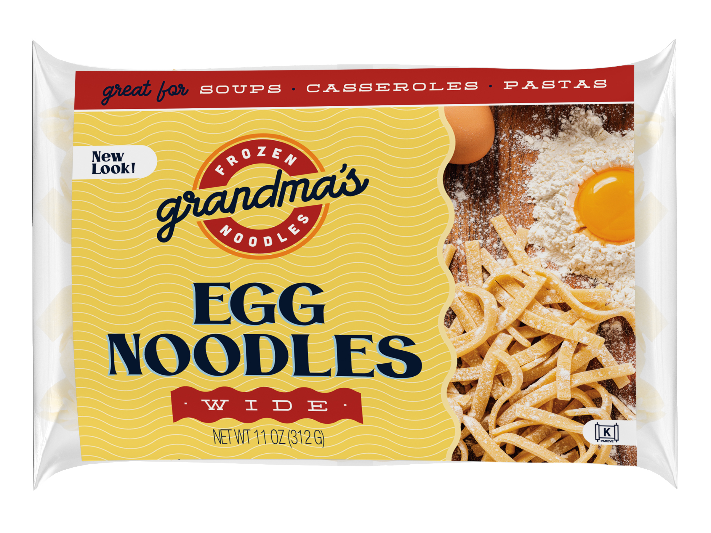
New Packaging
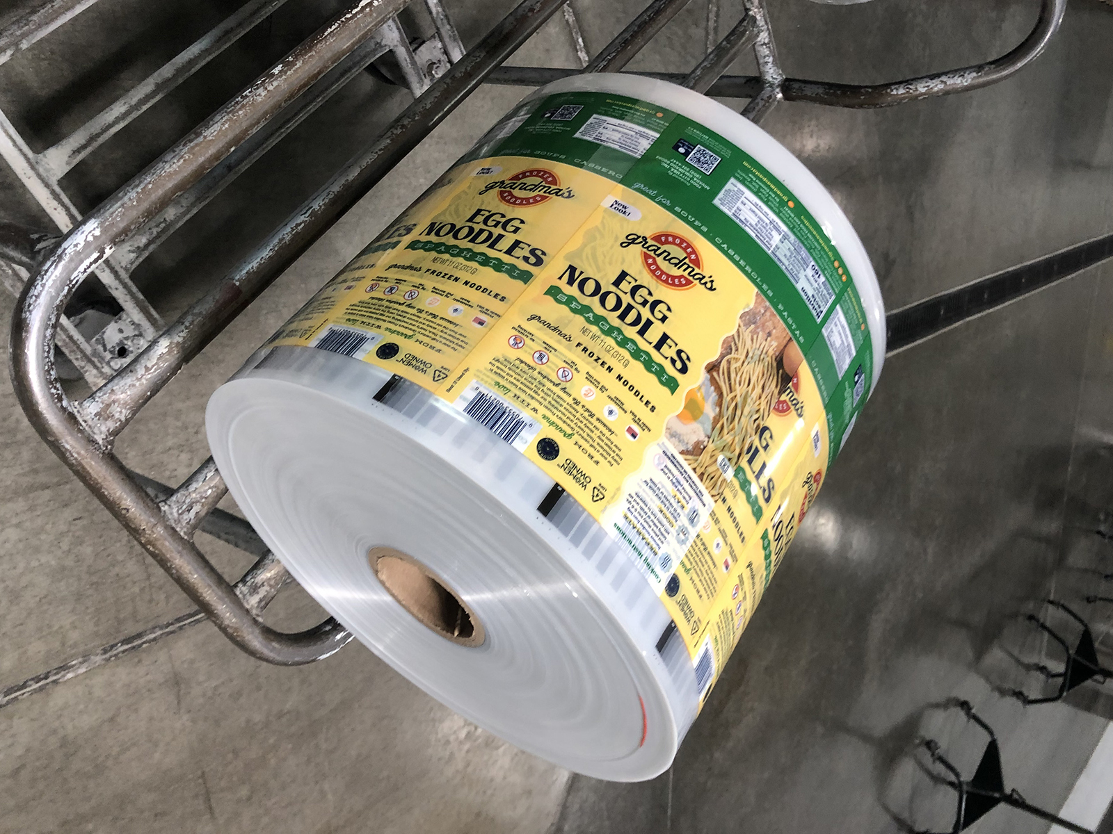
Getting Ready for Market
About This Project
Grandma’s Frozen Noodles, founded in 1961, with over 50 years in operation is a successful company with fairly substantial distribution. They have a quality product, made the in the Old Word way; that is, with fresh ingredients and Bronze-drawn. The noodles (wide and spaghetti) have a loyal, but limited consumer following. Primary usage is in soups, with consumption taking place during the limited, cold weather seasonal period of winter. And that limits sales potential.
When we started working with Grandma’s, we surveyed several grocery stores with the Company’s owner and sales director. We noted the competition and pointed out the design, packaging and communication trends that have evaded Grandma’s over the years. The existing Grandma’s brand was extremely dated. Colors, typography, product invisability and the logo itself gave the brand a low quality, low price look – not at all consistent with the owner’s vision for healthy, nutritious ingredients and a contemporary look that would appeal to today’s consumers.
Through our BrandVision process, we defined the new brand and its creative direction: new identity; a window to clearly show the product; professional photography showcasing the natural ingredients; a clean layout; and softer, more subtle colors to communicate premium-ness. In other words, a complete brand refresh, which we believe will redefine “Grandma” and broaden the consumer base, usage and sales volume.